
Design 5: Land Art. Year three.
This was the first project that I did in Brisbane and it was so totally different from anything I have ever done before. First of all working with a place that we couldn’t visit and also the fact that the brief was that from a real competition. The project was about creating a piece of land art in the desert outside of Dubai and the land art itself was supposed to be some sort of renewable energy. The groups were told to be bold and almost vulgar since the surroundings of the growing city of Dubai is so extreme in every way we had to match that and make something to fit into the context.
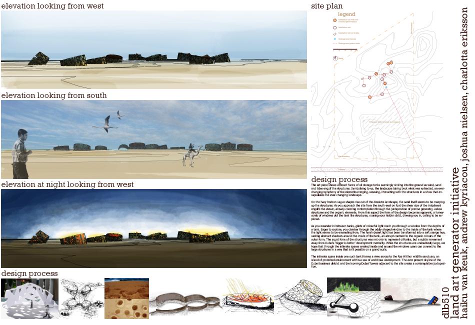
Our group focused on shadows on the sand and shelter from the harsh winds and strong sun. Dubai’s wealth is created on oil so we had this idea to imitate oil cisterns but with a more modern and sharp edges as a thought and a provocation to the oil industry with its renewable energy built into the shapes. Put in the landscape they look like they have been sunken into the sand and they themselves create a skyline by themselves almost like the one of the big city.
We had a good dynamic in our group and were able to divide the tasks but also help each other out when someone was stuck. It was a stressful couple of weeks before the handing but it was a fun project to make. On request from our tutor we let him send our project in to the competition. So fun, both to send something away to a real competition and also to have that gratification from our tutors that they really believed in our project and us.

Feedback from Ian Weir:
Interesting philosophical standpoint. We get a strong sense of the built landscape and ideas behind the scheme in the presentation. You have created a somewhat apocalyptic yet intriguing landscape. The design seems to have stopped too soon. Energy story is quite secondary regarding the comments in your text: not having direct physical experience with a site does not preclude site-specificity. Many international competitions and commissions
been won by designers who have never been to the site. The key is to uncover from the available information qualities that are particular to a place/brief (its all just information)
Very good graphics - though 'sameish' - eg it is a little too reliant on the one digital model - from which you generate most of your views. You don’t make it clear enough that the red crystaline roofs are the solar PV panels. Good idea to include your design process graphics on the bottom - some explanatory text on these might help judges.
Grade:
7 out of 7.
